Brand guidelines
Quiet interface, careful details.
The icons are the product, so the brand stays out of their way: neutral surfaces, one ink colour, and a mark that does the only joke.
The mark
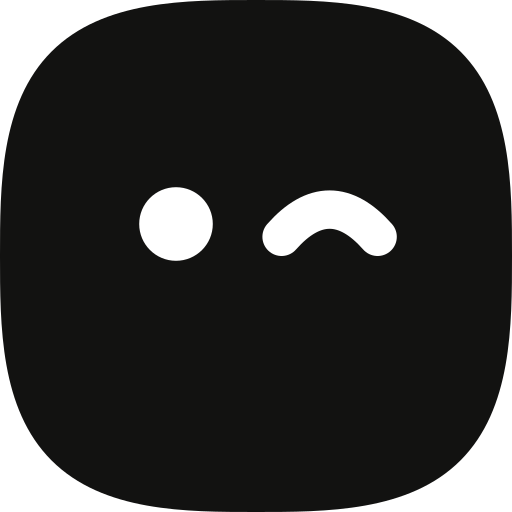
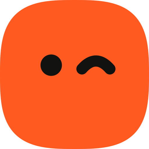
A squircle that winks. Drawn with the same corner engine as the icons.
One eye open, one winking: the left eye is a circle (r 2.3 on a 32 grid), the wink is a 2.4px round-capped arc. Don't add a mouth, don't recolour the eyes on their own, don't rotate or stretch it.

Moods
It has feelings, and only its eyes and posture show them. Hover or tap each one.
A mood changes the eyes by squashing them shut and opening them as something else, like a blink, so nothing pops. The body does the acting: it hops, tilts, shakes or slumps. Still no mouth, no brows, no accessories. Hearts are the one place colour is allowed.
Lockup
Mark plus name, set in Inter Tight Semibold.
clear space = ½ mark height on every side
- Gap between mark and name is ⅓ of the mark height.
- Minimum size: mark 16px on screen. Below 24px, use the mark alone.
- Always sentence-case “Not Boring Icons”, never all caps.
Colour
Mostly neutrals. Colour comes from the products people build with the icons.
Ink
#121211
Text, the mark, primary buttons, dark surfaces.
Canvas
#FAFAF9
Page background. Slightly warm, never pure white.
Surface
#FFFFFF
Cards, menus, inputs. Sits on canvas with a 1px line.
Line
#E9E9E6
Borders and dividers. One weight only: 1px.
Muted
#5D5D58
Secondary text and the grey half of headlines.
Signal
#FF5A1F
Keylines and construction marks. Never a button.
Type
Inter Tight for headlines, Inter for everything else, Geist Mono for code.
Display · Inter Tight 600 · −4.5% tracking
Softer corners, sharper details.
Text · Inter 400/500
Short sentences. Specific numbers. Say what the thing does and stop.
Code · Geist Mono
get_icon("trash", format: "jsx")
Two-tone headlines: the first clause in ink, the second in muted grey. Never more than two lines in a hero.
Icon rules
What every icon in the set has to pass before it ships.
- 24px grid, 2px padding. Everything lives in the 20px live area and is centred by eye.
- 2px stroke at 24px. 1.75 at 20px, 1.5 at 16px. Round caps, round joins.
- Optical corners. Small radii get more smoothing, large radii stay calm, everything in between is blended.
- Two details, maximum. At least 3px between parts. A third detail means the metaphor is wrong.
- Exact joins. Lines end on the real curve of what they meet. Nothing pokes past a rounded tip.
- Modifiers cut in. Plus, check, x and minus badges sit in a gap cut out of the base shape.
Voice
How the site and docs talk.
Write like this
- “Your agent finds the trash icon and writes the component.”
- “Use 2 at 24px, 1.75 at 20px and 1.5 at 16px.”
- “Requests usually ship within two weeks.”
Not like this
- “Unlock your creative potential.”
- “Revolutionary AI-powered icon solution.”
- “Elevate your design workflow.”